Why I love Calligraphy!


Society today is like a pressure cooker. Everything's on a constant go go go, without a pause or a breather. In the past, I felt like I'm constantly moving from one life stage to another, trying to accomplish goal after goal. And life passes me by, so quickly.

By any chance, are you a workaholic?

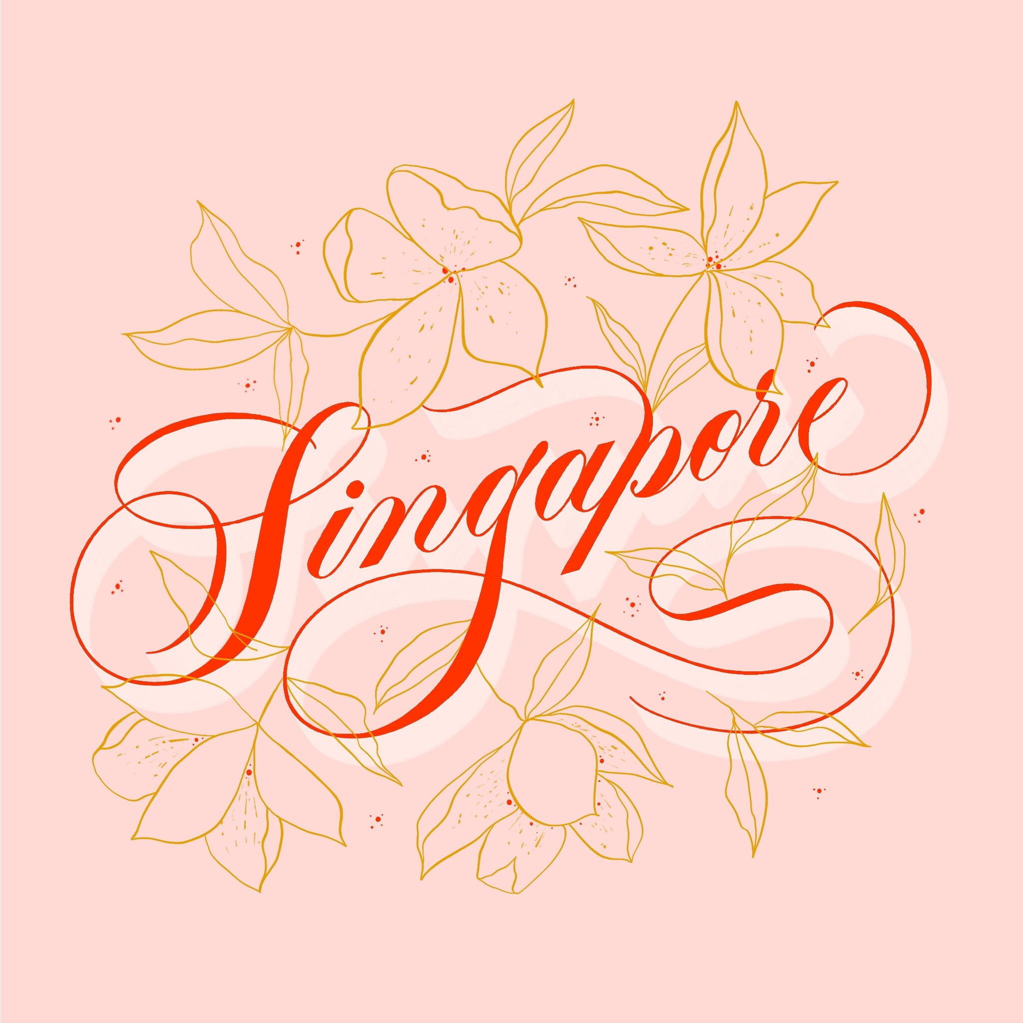
Many of us take good care of our friends and family but we often fail to take good care of ourselves. I'm personally a really future-oriented person and struggled so much trying to be present. And I know I'm not alone; I've taught hundreds of students in my workshops so far in Singapore and that's one common thing I've noticed coming up over and over again.

When everything tries to capture our attention - from social media to work to daily news and personal responsibilities, we dedicate lesser and lesser time to ourselves, our creativity and inner child.

To share, I firmly believe that I didn't find calligraphy.

Calligraphy found me. Period.

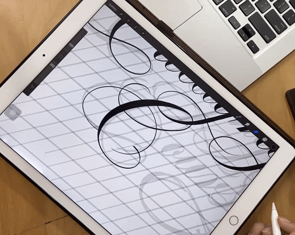
Maybe it was the beauty of the letters or the mark-making process of calligraphy or how it allowed me to appreciate the meaning of words and language even more - honestly, I'm not sure if I can even pinpoint or articulate how this feels. I just know that I had a natural curiosity about it that led me googling about calligraphy, picking up a pencil to write, mimicking the strokes till late at night. I just wanted to know how I can do it too. How can I get better?

There's just something so cathartic about putting pen strokes to paper. It helped me to pause, focus and breathe. Just like a runner's high, calligraphy helped to replenish my mental and emotional energy. It helped me to be more introspective, to look inwards for mental clarity - kinda like meditation but through working with my hands. And by working, I really meant play.

Calligraphy is therapeutic and relaxing to me. Watching ink flow from pen to paper, appreciating the texture of organic strokes - I just love how satisfying and free flowing calligraphy is. It's like dancing on paper, just letting my hand just be. Through this art form, it pulls my attention to just writing, one stroke after the other. And it centers me.

Heck, my passion grew so much that I can't see myself doing anything else. So I hustled everyday to turn my passion into my full-time career.

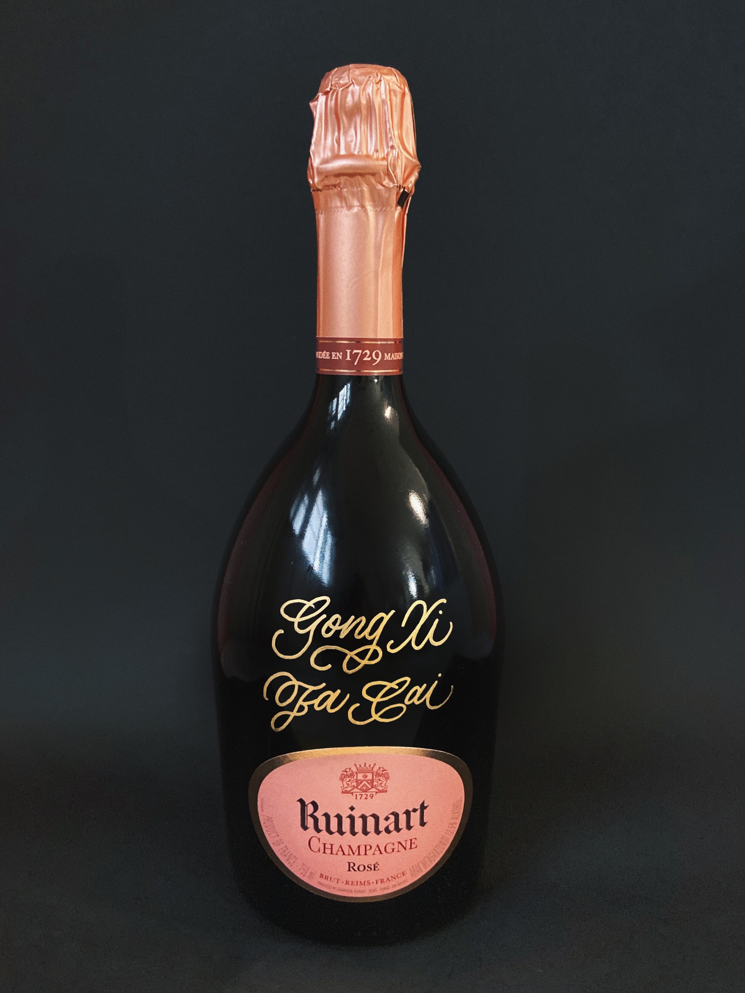
And now I can't believe I get to call this my job and work with amazing brands like Google, Uniqlo and Washington Post and do that one thing I love so much - art ❤️️ Here's me (right) at Lamborghini's private event, where I was hired to calligraph gifts, live on-the-spot for the esteemed guests there.

Live Calligraphy Event for Lamborghini

Live Calligraphy Event for Lamborghini

So, if you're reading this, I encourage you to question where you're at in life right now. Are you really present? Have you put life back in "work life balance"?

If not, there's no time like the present to intervene your own life and make choices that help you live the life you want.

Make choices that serve your desires. Take control of the steering wheel. Take control of your future.


I’ve never seen any life transformation that didn’t begin with the person in question finally getting tired of their own bullshit.
— - Elizabeth Gilbert | Author of Eat, Pray, Love

I love this quote by Elizabeth Gilbert. Doesn't reading this make you wanna get your life together? It definitely does for me.

I hope that you can gift yourself the joy of creating art, to rediscover your creativity and inner child, and to be fully present in your life. If calligraphy gives you joy and you're genuinely interested in it, lean into it and you'll be surprised by what you'll find on the other side.

I'm leaving the link to The Ultimate Calligraphy Course here: https://www.theultimatecalligraphycourse.com. If you'd like to sign up, welcome! I can't wait to share all I know about calligraphy with you.


[NEW] Calligraphy Kits! - The Ultimate Calligraphy Course


I'm excited to share that Calligraphy Kits are now available! 🎉❤️🙌🏻

With Singapore's recent tightened covid measures, I've since cancelled upcoming in-person classes, and those occurring in the later months are on pause until further notice.

It's kinda like a semi-lockdown right now. I hope you're keeping safe wherever you are, and staying sane! 

Coincidentally, my urge to bake is resurfacing again…

*Update: we made brownies and coffee! & nope it isn't dalgona coffee 😂

Anyway, because of this semi-lockdown situation, I've been getting more enquires about my online course recently and some of y'all mentioned that you don't have access to a printer to print out the course worksheets.

So I've decided to put a calligraphy kit together! 🥳️

The Ultimate Calligraphy Course - Calligraphy Kit Flip-Through.gif

Essentially, this workbook contains all 200+ pages of worksheets for the entire 6-week course, covering everything from Copperplate basics, minuscules and majuscules, flourishing, modern calligraphy, ligatures, composition and layout, digitization and more. Double-sided print and ring-bounded.


Together with the workbook, this kit will also include:

  • 1 Writing Pad or Tracing Pad (depending on stock)

  • 1 Pentel Touch Brush Pen (Black), 1 Koi Brush Pen (Colour)

  • Several heavy-weight paper in various sizes for you to create your very own calligraphy art masterpieces with

  • Custom place card of your name flourished by myself!


Of course, the online course will have the worksheets downloadable when you sign up. But if you'd like me to prepare all the materials for you on my end and mail em' to your doorstep (worldwide shipping), this is a supplementary optional add-on without the hassle. 

And you can get started on learning a new skill straight away! :-)

Sign up for the course here! And for the calligraphy kit, you may purchase it as an add-on here.

I hope that you'll find this addition helpful. If you've any Q's, reach out to me at hello@leahdesign.sg and I'll be there to help!


How to Calligraph on Wine & Champagne Bottles! Sharing all my tips & tricks!

 
Wine & Champagne Bottles - Calligraphy Customisation - Manulife.JPG

I’ve recently wrapped up a custom calligraphy project with Manulife Singapore, where I was sent 110 bottles of wine and champagne to customise. After sharing images and videos about these, I’ve received several questions about my process, so here’s a list of compiled questions and answers to help you if you ever wanna do something similar!


Process

  1. Before writing, first ensure that the bottles are in room temperature, not chilled. Condensation on the bottle is hard to work with and it’s a definite no go!

  2. Sort all names in alphabetical order and print out the name lists for easy reference. For me, I printed out one name list for Champagne and another name list for Merlot, both lists in alphabetical order with allocated quantity.

  3. I’m using Painty Metallic Gold Marker by Zig. Shake well and test on paper first before writing in case of any ink explosion (we definitely don’t want that!).

  4. Ensure that your writing surface is clean from any dust. When shipped in boxes, they tend to be quite dusty straight from the box! This step helps to prevent any clogging or y’know those bumpy small areas in your ink when dried? Yeah, nasty stuff. Clean yo’ surfaces for smooth application AND finish!

  5. To stay organised, you may also have a separate pen to check off names when you’re done with each bottle. But, I personally skipped this! I think it slows me down a little. (Or, have someone help you out with this step!)

  6. Don’t forget to let your ink dry, don’t touch or accidentally smudge it.

  7. As I’m writing, I line up the bottles in rows of 5 or 10 so it’s easier to count the quantities in total at the end. Once done, double check spelling and the total number of bottles. We wanna ensure that the Client gets all the bottles with everything spelt right with accuracy! Getting sent back bottles with misspelt names equals double the admin, process and work so let’s strive to get everything right first time round!

  8. Don’t forget to photograph your work so that you can add em to your portfolio for future client jobs!

  9. Finally, time to pack! Remember to tape all ends of the boxes both top and bottom to secure in case of damage during transport or shipping. I also label each box at the top for the Client’s easy reference. So for example, if a box contains all names from L to W, I’ll write "L-W” at the top of the box.


You’ve asked some Q’s, here are the A’s! + tips and tricks!

Q1: How do you keep your calligraphy straight?

Thankfully, the Merlot labels are rectangular and that helped to provide a straight reference guide for me. I personally find circle labels or anything curved to be trickier to visualise a straight line!

*Hot tip!* When you’re writing, remember to rotate and tilt the bottle with your non-writing hand in small increments while pivoting the bottom of the bottle against your writing surface. This helps to support your script and writing hand while maintaining good eye-level alignment (ie. no parallax error which causes letters sloping downwards) Here’s a visual example:

Thomas 4by5gif.gif

Alternatively, you can also use pencils and draw guidelines for yourself prior to writing. Stabilo All Pencil or Glass Marking Pencil (White) would work great for glass surfaces! Or potentially, you may also use a white chalk pencil. If you do go for this step, remember to only rub off the marks with a cloth or tissue only after the initial gold ink has fully dried.

Q2: How do you keep your calligraphy centred?

Great question! This definitely comes with practice and experience. Try to visualise the middle letter to be directly underneath or above the mid-portion of the label. For example, if I’m writing the name “Gabriella”, I can visualise letter “i” as the central letter of the name and this letter should sit at the middle of the bottle. From here, I’ll gauge how far left and right the other letters would go.

*Note: This also depends on the capital letter! For example, a capital G or M is wider in width than a capital I. So do adjust accordingly.

*Hot Tip!*: If you’ve a really long name to write, try air-writing on the bottle first to gauge spacing ie. hover your finger above or on the bottle and practise writing to see if it works first. Once you’ve your eyes fixed on the placement, try it with the marker.

*Hot Tip!*: If you’ve finished writing a name and see that it’s not centred, here are two ways to fix:

  1. If the name is flushed towards the right, add additional flourishes to your first capital letter to extend the front part of the name.

  2. If the name is flushed towards the left, extend the last stroke of your last letter (also known as an exit stroke) to extend the last part of the name.

And if all else fails, read Q3!

Q3: What happens when you misspell? Does the Client provide you with extras?

Wine and champagne aren’t cheap so the Client didn’t provide extras for me, which I totally understand! Usually, for more budget-friendly product materials such as branded notecards or anything paper, I’d ask for anywhere between 10% to 25% additional quantity. But in this case, I didn’t. Anyway, no worries! If you misspell anything, you can quickly remove the ink using rubbing alcohol since the marker is an oil-based one.

*Note: If you’re doing calligraphy engraving, however, there’s no going back! In this case, I’d recommend perhaps adding marking guidelines with the pencils I’ve mentioned above in Q1. Or you can also use a liquid chalk marker to draft your design and engrave directly thereafter as chalk ink can be easily removed afterwards with a damp cloth, leaving you with only the engraved design. For anyone who’s interested, I use Stylo+ by Dremel for engraving!

Calligraphy Engraving - Leah Design Leah Chong.gif

Q4: Can I use other types of markers?

I’ve tried other markers before finally sticking to Painty Metallic Gold Marker by Zig. I find that this marker gives a really good and bright shine while still being semi-matte. And I love this look! I’m usually very particular with the gold shade too - overly yellow warm gold isn’t my favourite. I prefer a more cool-toned gold. Either way, experiment with other markers and see which you like! I’d definitely stick to oil-based markers instead of any acrylic or water-based markers as oil-based inks are resistant to water and scratches but acrylic or water-based ones may risk smudging or lack in longevity (especially when the customer brings the bottle out after chilling and water condensation hits).

Q5: Do you seal your writing?

I don’t as I’m using oil-based markers! If you’re using acrylic or water-based markers then yes, seal it!

Q6: How long did everything take?

For all 110 bottles, I believe I took 3-4 hours! And 1 hour for packing and unpacking, counting, printing the name list etc. etc. - all the admin things. Oh, btw - 1 painty metallic marker lasted me through the whole thing!

Q7: How did you get this job?

Manulife emailed me via my website! I had other wine engraving and custom inked wine bottles on my website so I believe that’s how they found me. Always remember to photograph your work and share on socials and/or portfolio! If you don’t have any prior bottles to show, don’t let that stop you. Be your own client and buy yourself or a friend one (or some) and treat it like a client job! You can also practise your script in pencil first and once you’re comfortable and confident, try it on the bottle.


That’s all for now! I hope this helps. If you’ve any questions along the way, don’t hesitate to comment your question below or DM me on Instagram and I’ll be sure to answer and help. Thanks for reading and all the best with your wine writing! 🥳️

P.S. If you’re looking to start your calligraphy journey or improve your current skills, feel free to check out my online calligraphy course here!


Calligraphy and Hand Lettering are NOT the same! *Sharing my whole process!*


Today, I’d like to share on the process behind-the-scenes on how I made my calligraphy course title design! 💫

So Brush Calligraphy and Script Lettering - What's the difference, you might ask?

For starters, one took me 3 mins and the other took me 10 hours. Can you guess which is which?

As someone who does both brush calligraphy and script lettering, my process goes like this:

1. Concept Ideation + Draft Sketches

Sketching.JPG

The first step for me usually starts with pen and paper! Here I'm churning out sketches, trying out different layout and compositions and seeing which is the most effective of the lot. Go crazy, go messy - its all part of the creative process.

Don't let fear stop you from creating. Remember, there's always another piece of paper!

2. Brush Calligraphy

The Ultimate Calligraphy Course - Brush Lettering Demo gif.gif

Here I'm using the Pentel Touch brush pen - essentially its a brush with a pointed nib. The nib flexes and renders thick and thin strokes depending on the pressure applied. Therefore, it gives you great visual contrast in your script, which makes it look really elegant yet bold at the same time.

So brush calligraphy - essentially this is penmanship, where you're creating the letters in *single strokes*!

3. Refining via Script Lettering

Script Lettering Process on Procreate.gif

I then take a picture of my calligraphy script and import it into my iPad > then into Procreate, which is a digital drawing app. From there, I'll redraw, refine and iterate the design to my liking.

I can get really nitty-gritty in this step: refining each individual curve, adding more visual weight to some strokes or reducing weight on other strokes and even shifting whole words, nudging and aligning them in the perfect layout and composition.

If you don't have an iPad, don't worry! You can do the same with tracing paper, layering sheet after sheet and refine along the way.

In this step, lettering is no longer penmanship (creating single strokes) but draftsmanship; drawing with *multiple strokes*!

Here are other examples of my work that's not calligraphy, but hand lettering (where I sometimes also like to incorporate illustration!)

4. Finalisation of Calligraphic Design + Optional step: Scene-setting, flat lay photography, post-edit + mockup

Photography Mock Up.gif

All in all -

Script lettering takes more hours as it’s more about drawing, refining, iterating and brush calligraphy, on the other hand, renders a pretty instant result.

The process taken to achieve each of the two differs greatly, but they can absolutely look similar visually from the initial concept to the final design.

And this is because, for script lettering, its letter construction process is – at its core, fundamentally built upon a deep understanding of calligraphy.


I hope you've enjoyed learning more about my process!

If you're keen to learn more about how you can do this for yourself too, know that The Ultimate Calligraphy Course is built with the aspiring calligrapher and artist in mind, as well as lettering artists and designers who are keen on exploring script lettering.

So while this is not a lettering course (a separate discipline on its own), lessons learnt from calligraphy are transferrable and applicable to script lettering designs!

This course is great for both beginners and practitioners alike who seek to utilize a new skill set for custom calligraphy and design projects - from simple hand-written greeting cards, envelope addressing and quotes to more advanced applications such as wedding invites, stationery design, script-based logo design and branding, calligraphy hand-engraving and more.

Sign up here: https://theultimatecalligraphycourse.com/ !


5 untold lessons on how to get better results in Calligraphy


Calligraphy isn’t easy but the process shouldn’t be painful. So here’s my top 5 untold lessons on how to get better results in Calligraphy!

A myriad of fun calligraphy styles I drew on Procreate and analogue (paper) and compiled in Adobe Photoshop

A myriad of fun calligraphy styles I drew on Procreate and analogue (paper) and compiled in Adobe Photoshop

  1. Master your basics first.

    If your letters don’t look good in pencil, they probably won’t too with a brush pen or pointed pen.

    Similarly, if your base script foundation doesn’t look good, piling on flourishes won’t mask the mistakes either.

  2. Be legible first, fancy later.

    Imagine: your letters are the base foundation of a cake and flourishes are icing on the cake. If a cake looks good but tastes bad, would you eat it?

    So - if the script looks fancy, but it’s hard for someone to read it, would you say it has served its purpose*? Remember, good design serves both visual appeal and practical functional use.

    (*Notable exception: abstract art)

  3. Know what you’re studying and what you’re practising.

    Traditional script follows consistent rules and guides. Modern calligraphy breaks them.


    First off, there are many different types of traditional script. It’s important to focus on one style before moving on to the next as individual scripts would display different traits and features such as slant angles, letter ratios, letter connection, stroke contrast etc. If you’re learning both Copperplate and Spencerian at the same time, it may be confusing! Plus, it’s easier to gain muscle memory focusing on a single script first than multiple scripts.


    Pablo Picasso once said — 'Learn the rules like a pro, so you can break them like an artist.' That’s where the fun starts.

  4. Observation first, practise later.

    Most would preach “quality is more important than quantity”, but there are also merits in quantity leading to quality over time.

    But hey - why not both? Quality AND quantity ie. train your eyes first before training your hand. Now that our eyes are trained to spot the differences between good and bad work, next - let’s put in the practice hours to train our hands, and bring our work from good to great.

    Don’t be wasting time practising a stroke 1,000 times incorrectly, this just reinforces bad habits which have to be unlearned later on. 

  5. Challenge your mind: question everything, assume nothing.

    When it comes to learning, reignite your child-like curiosity. Challenge your mind: question everything, assume nothing - that’s where we can gain clarity and fully comprehend why things are the way they are.

    If not, we’d just think we know when we actually don’t. And even if you can’t find an answer right away, you’ll probably learn way more in your search for an answer than assuming the status quo is right.


I hope you’d find these lessons helpful! I wish someone told me all these when I first started. If you’re feeling ready to level up your calligraphy, feel free to check out my online course (with a free class available to watch). I’ll share and teach you all I know.

Meanwhile, I’d love to hear your thoughts. If you’ve any questions - comment below, I’m here to help!

Cheers,
Leah