Live on-site calligraphy event process, insights and tips


I'll be at LANEIGE's ION Orchard store on 27 Aug from 5-8 pm! Customising on their new foundation:

laneige.jpg

Since it's an upcoming event and I know some of you creative peeps may be keen on doing events in the future, I thought I'd let you in on my process!

---

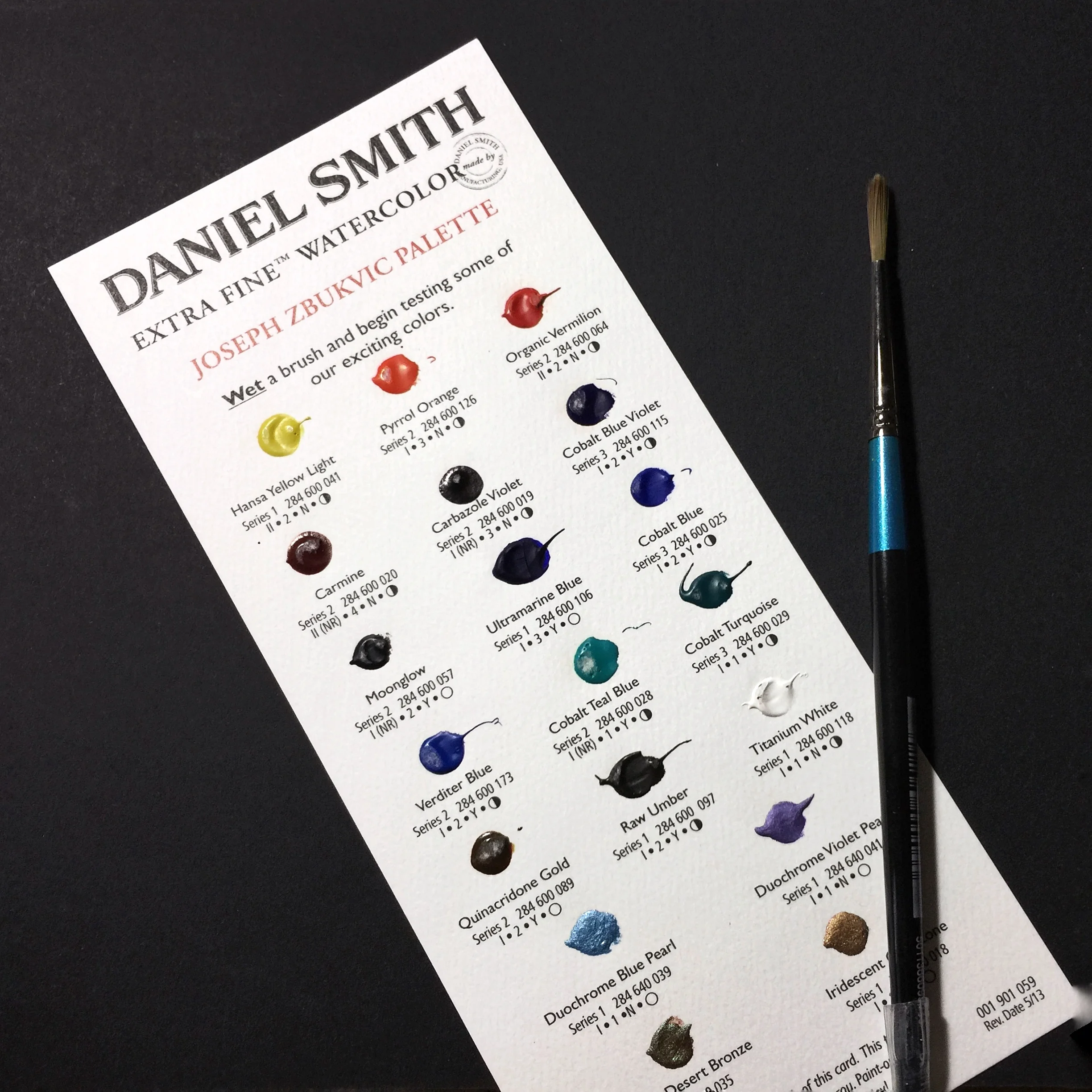
Here are some behind-the-scenes pictures of me testing on their product:

IMG_2018.JPG
IMG_2019.JPG

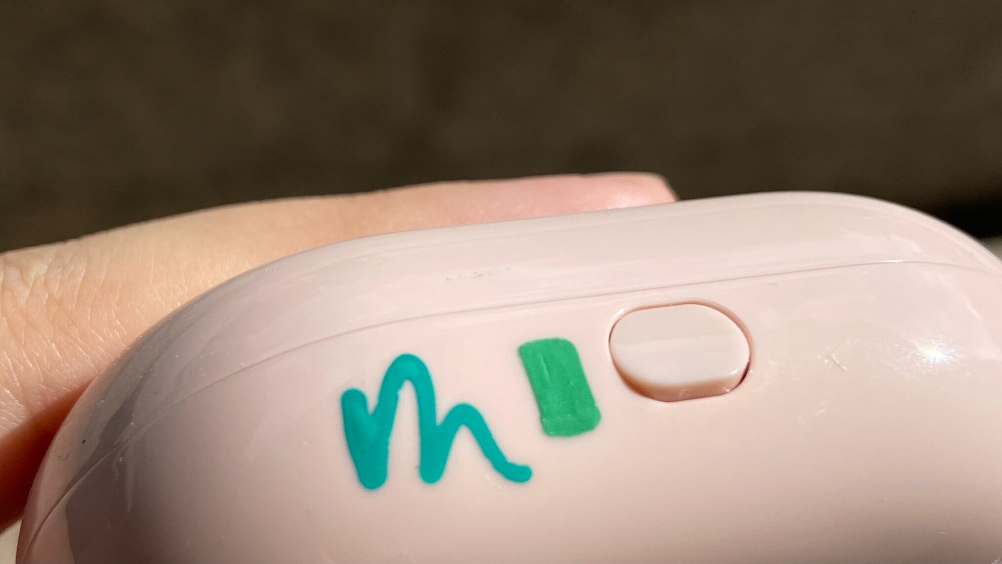
​Before a client event, I'd always request for the product item to be sent to me for testing. This helps me to test inks beforehand and ensure that the event will run smoothly as anticipated!

As an artist producing art live, on-the-spot, there's no room for screw-ups and/or guesswork. You're representing not only you yourself as the artist but also the brand who hired you too, so ensuring everything runs perfectly is a minimum requirement.

Other than that, punctuality is a must and customer service and are-you-able-to-handle-potentially-difficult-customers are also great pluses as a live artist!

Producing good work also means 2 things:

  1. Are you able to create good work that both the customer and client are happy with and

  2. Are you able to produce work at a satisfactory pace esp. when there are many waiting in line for your service!

To share, the craziest event I did was at Uniqlo's (linked case study here). One time I had to write 150+ quotes on cards in 4 hours, which was 37.5 quotes per hour. In other words, I had to write 3+ cards every 5 mins (RIP to my right hand).

In hindsight, it was still doable as I think I'm a pretty fast writer but I was also trying hard to maintain the quality despite being fast. If there were more customers in line, perhaps having an additional calligrapher for that event would be really helpful! So another good tip is to ask the client how many customers they're expecting for the event so that both parties expectations are aligned!

Anyway, as you can see - these testing pictures above usually aren't "pretty". There was some back and forth between me and the client when it comes to choosing the exact shade of green and pink that they're looking for! :-) In the end, they chose the soft pink shade as well as the turquoise (more blue-green) shade.

Another tip: if the project scope changes, you can always provide alternative suggestions and be a communicative collaborator instead of scraping the whole project!

Initially, it was supposed to be an engraving event where I'll engrave on the item, but this surface wasn't the most suitable. I then suggested to engrave on the mirror inside the foundation case instead but later on, I learnt from the client that some customers may be sensitive to others touching anything inside the foundation case ie. the cushion. So we had to scratch that idea and change it to custom ink instead.

Hope you enjoyed this blog post! Feel free to leave a comment if you’ve questions and I’ll be sure to get back to you.


Of the highly applaudable first post & the 2 hardest questions in art


Hello nice, friendly people of the Internet! 

I've always wanted to give this "blog" thing a shot. There's something pretty charming about writing - the well-thought out words and intricately formulated sentence structures or lack thereof, getting inside someone's head, understanding their thoughts and seeing the world through their eyes for that brief moment in time, really, somewhat appeals to me. It isn't quite my forte, but hopefully I can get better at writing. Maybe look back and reflect on my naivety, *oh god how stupid was I back then* moments in time to come.

Plus, parts of me tend to have a chatty side; I can have loads of thoughts in my head but it could be nice to "talk" to someone through here and never know who is listening (yes, uncertainty can be sexy). Huge chunks of words for Instagram captions are fairly inappropriate for that choice of medium anyway (I mean, do you even read long Instagram captions? I am guilty to admit to my crime of just liking and scrolling past lengthy captions sometimes. Sorry friends, I still care, just manifested in different ways.)

Anyhow, so I've been thinking of what I could do with this space of mine. I'd love to do tutorial posts, how-tos where I share my techniques and knowledge on lettering/design or what not. But I figured you'll never get to know me, me, that way, which is why I hope to write thought posts like these. You may get some insights from it, reflect and see if it applies to your own life too, maybe? You don't even have to agree. It's just me being stripped down and letting you into my space. Okay, shut up Leah, let's get on to what's up right now before this post goes on and on like how J.K. Rowling does her books. 

So yesterday, I attended a private talk organised by Leach (aka my twice-my-age-sister-from-another-mother friend who in all seriousness, does watercolour like a magician), and hosted by Wheeteck and Yipeng from Arters. If you don't know about Arters, they run an e-commerce business selling really cool art supplies from scented inks to atas brushes - god knows what else but I wish I can buy everything they have. They have tons of fine quality supplies! Arters is a family-run business, and they are the sole distributor of Daniel Smith watercolours in Singapore. First of all, I am terrible at watercolours. I haven't tried many brands on this medium as much as I had for calligraphy and lettering (story for another time, promise), but when WT explained the beauty of Daniel Smith's, I was sold. 

Photo Credits: Arters

Photo Credits: Arters

You know how some paints look all gross and mouldy as though they had a hangover and gone homeless for days? Daniel Smith's, however, remains fine and classy no matter how long you abandoned them for. As WT explained, all Daniel Smith's paints are infused with a binder/ gum arabic, down to the tiny particles. Unlike other student grade watercolours which contain fillers, the makers ensure that every single molecule of Daniel Smith's watercolours is well-coated with that layer of gum arabic so that it helps to prevent clumping of paint after being thrown aside and let dry for weeks.  

*Update: Arters has unfortunately, closed down. For Daniel Smith paints, try here.

- cue digression -

By the way, fun fact, do you know how gum arabic looks like? No, I'm not talking about the highly processed and manufactured end product. I'm talking about the origin. Me neither, so I googled and threw it in for you. 

Behold, the Acacia Nilotica tree (or rather, part of). 

This reminded me of the hong kong snack 雞蛋仔/ egg waffle. Anyway, this picture above is the fruit of the tree but really where the gum is from is actually from the bark. Holes are made and the hardened sap is collected. Also, the reason why gum arabic is named the way it is, is because its a gum and it originated from Arabia. How highly creative! I know... just like my Instagram handle @leahdesign. 

By the way, did you know that gum arabic can be used for calligraphy too? If you happen to have inks that are too thin so much so that it bleeds into the paper, try adding some gum arabic next time round. It'll help the ink to increase its viscosity and you'll achieve clean lines thereafter. If that doesn't happen, it's probably cause the paper you've used isn't ideal. I have never tried this before but I believe the recommended ratio is 1 part gum arabic to 4 parts of ink. Then again, this highly depends on the individual ink itself and how thin it already is. 

- end digression -

During the session, we also got to try out Daniel Smith's watercolours. Being lazy, I ended up walking around and talking to people instead of trying the paints out like everyone did. But to the main point - when WT did a live demonstration, I realise that his style of painting is much akin to performance arts, to which he agreed. Unlike many watercolour artists I see on my noisy Instagram feed, WT's style is manifested in exaggerated arm movements, brush strokes and water splatters. It felt "unplanned", as though he was playing more than painting, as though he just went with it and just be. (Maybe a good analogy would be learning the dance moves and executing them as they are VS learning the dance moves and letting go). 

I asked him, "How do you know when to stop?". 

"The two hardest questions in art is to know how to start, and how to stop", he said. How disturbingly deep that is! It made me ponder quite a bit. To me, yes, starting is difficult. Whenever it comes to the activity section of my lettering classes, I always have to tell my students to not be intimidated by the big white spaces of the paper itself. Starting on something new is always seemingly daunting. There's many directions you can go with art and just like your life choices, one step leads to another and there's infinite permutations of where you could possibly end up at. If only you knew the "perfect" path, right? How bloody annoying. But hey, you can always take another piece of paper *ha!

Unlike "The Game of Life", I don't think there's a winner or a loser to a piece of work, just like how grades shouldn't be assigned to art (which calls for another post altogether on whether a piece can be graded an F by teachers). Sure, there's always room for improvement especially technique wise, which could be an area of critique but style wise, I beg to differ at times. It's something you've created, uniquely you and even if it isn't my cup of tea, I'd respect that. If you see something that inspired you, pen it down, draw it out or translate that inspiration to your own art form, be it music, dance or whatever that is that excites you. Starting doesn't have to be that difficult. Just start.

So now that we've semi-established that, how do you know when to stop? Which is harder, starting or stopping? Honestly, I've no idea. But I do know that it is easy to leave a work halfway. Maybe you're burnt out creatively, or perhaps, physically exhausted from the hours and hours of work you've put into that piece. 

On the other side of the spectrum, some artists "overwork" a piece. Wait, you can actually do that? Well, yes, I do believe that there's a notion of perfection that one may yearn to achieve or maybe he/she/preferred pronoun has a set of expectations to live up to and it is in that state of perfection chasing, where one may lose track and not know when to stop. A good way to "know" that point of overworking is to sleep on it and come back to the piece with a fresh pair of eyes. Sometimes, it may not be good to do a piece all in one sitting. Or if you're already having thoughts like "Is this too much?", then yes, given that you had that inkling, it's highly likely the case.

Anyhow, my take on it, is that you're you. You're the artist. You're the creator. The piece is done when you decide it's done. Ain't no Tom, Dick, or Harry to tell you when and how to stop. You decide!

WT didn't give me an answer but I guess here's my thoughts on it. I apologise if I sound like I'm blabbering cause I probably am. I may even have contradicted myself, damn. But yes, here's the inner workings of my mind.

Just to close this already lengthy post, we each receive this sample too: 

fullsizeoutput_121.jpeg

Thank you to Arters for their generosity! Can't wait to try these out. And of course Leach, who helped to organise this. 

If you have any thoughts on my thoughts, write to me. I'm curious to hear what you think too. For now, I shall maintain that the "two hardest questions in art" is still a life mystery and shall revisit this in future.

Much love,
Leah